
Lawrence University Buildings quadrant chart
23 images, from the TierMaker template “Lawrence University Buildings”. Plot Lawrence University Buildings anywhere on a two-axis chart, such as good to bad and fun to boring.
Top left
Top right
Bottom left
Bottom right
Photos are for this visit only: in your downloads, never saved or uploaded.
Canvas
Pictures100%
23 to place














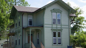


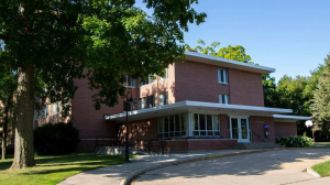





Top Lawrence University Buildings, ranked by fans
No top list yet — your picks and finished rankings start it.
How a quadrant chart works · How to make yours
How a quadrant chart works
A quadrant chart has two axes that cross in the middle, which splits it into four corners. Where you place something shows how it rates on both.
Leave the middle for the ones you can't decide on.
23 images, from the TierMaker template “Lawrence University Buildings”.
Every pick and every finished ranking here counts toward the fans' top Lawrence University Buildings.
How to make yours
- Click the axis labels to name them.
- Drag each pick to its spot on the chart.
- Change the canvas size or the picture size from the controls above the chart.
- Your board stays in this browser while you work. Save it to your profile, download the picture, or share a link.